
HDR Real Estate Photography Editing Style
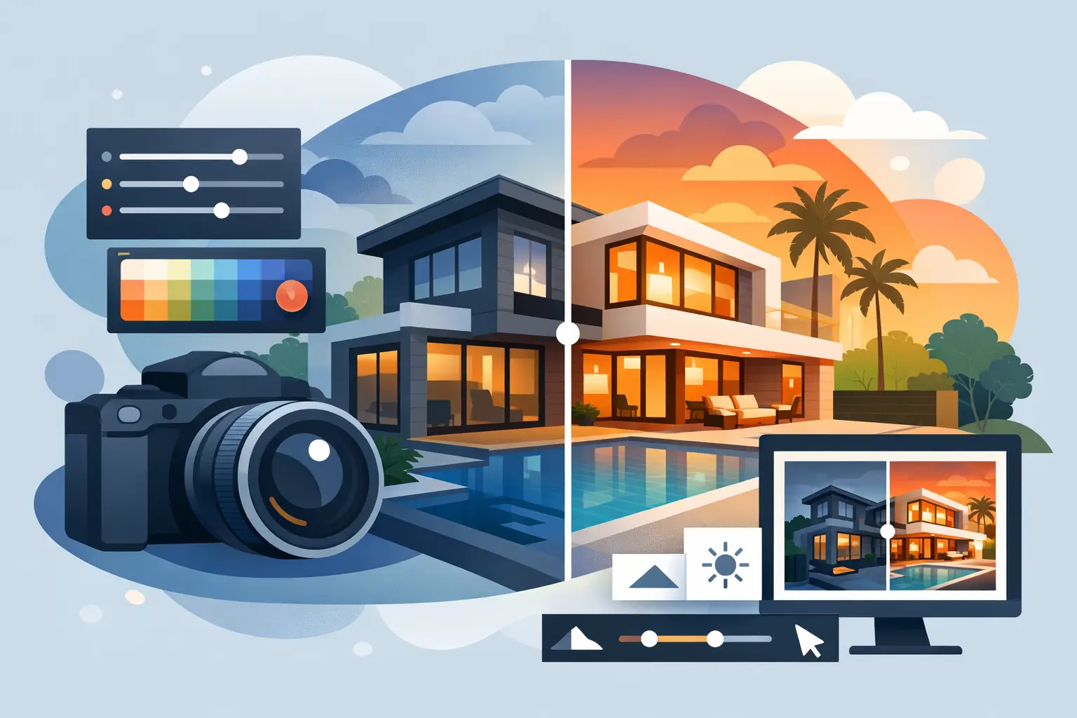
A bright living room can win the click, but if the windows glow like a white sheet and every wall looks radioactive, buyers notice for the wrong reason. That is the real issue with hdr real estate photography editing style – not whether it looks dramatic, but whether it helps a listing feel credible, polished, and worth seeing in person.
For agents, editing style is not a small technical choice. It shapes how buyers read value from the first thumbnail. A strong edit makes rooms feel clean, open, and true to life. A bad one makes the home feel cheap, dated, or suspiciously overprocessed. If your goal is more clicks, more showings, and fewer “this looked different online” moments, the editing style matters.
What hdr real estate photography editing style actually means
HDR stands for high dynamic range. In real estate photography, that usually means blending multiple exposures of the same scene so the photographer can hold detail in bright windows, darker corners, ceilings, floors, and furnishings all at once.
The blending itself is only the starting point. The real style shows up in how those exposures are combined and finished. One editor may create a crisp, natural image with balanced contrast and accurate color. Another may push the same room into a harsh, surreal look with heavy halos, muddy shadows, and colors that do not exist in the actual home.
That distinction matters because buyers are not grading your photography technique. They are deciding whether the property feels inviting, well kept, and worth touring.
The best HDR style for listings is usually the least distracting
A common mistake is treating HDR like a visual effect. It is not there to announce itself. It is there to solve a problem: interior spaces often contain both very bright and very dark areas in the same frame. The best hdr real estate photography editing style handles that range quietly.
That usually means neutral whites, controlled highlights, realistic window detail, and enough contrast to give the room shape without making the shadows look dirty. Floors should still look like floors. Cabinets should not glow. Exterior views through windows should be visible, but not so dark and dramatic that they look pasted in.
Natural does not mean flat. A good real estate edit still has punch. It just keeps that punch tied to the home rather than to the software. Buyers should notice the kitchen island, the fireplace, the natural light, and the layout. They should not notice aggressive edge sharpening or oversaturated grass.
Why editing style affects listing performance
Agents often think of photography in terms of quality, but consistency is just as valuable. A reliable editing style helps your listings feel stronger as a group, which supports your personal brand when sellers compare your marketing to other agents in the market.
There is also a simple conversion angle. Overedited images can hurt trust. If a buyer clicks because the home looks glossy and dramatic but arrives to find dim rooms, yellow walls, or much less space than expected, disappointment starts before the showing even begins. That gap between online presentation and in-person reality costs momentum.
On the other hand, clean HDR editing helps buyers move from interest to action. They can understand the room. They can read the finishes. They can see where the natural light is coming from. That clarity reduces hesitation and makes scheduling a showing easier.
The visual traits that make HDR editing work
A high-performing HDR style usually comes down to restraint and control. Vertical lines should be straight so rooms feel stable and professionally presented. White balance should be corrected so walls look neutral and different light sources do not fight each other. Contrast should be enough to define the architecture without crushing darker details.
Window exposures are one of the clearest signals of editing quality. If the view outside is completely blown out, the image feels sloppy. If the window scene is too dark and overly dramatic, the image feels fake. The right balance shows that the room is bright while keeping the outside believable.
Color is another major factor. Real estate images often fail here. Warm wood can suddenly turn orange. Grass becomes neon green. Blue hour skies become electric. Those edits might grab attention for a second, but they do not age well and they do not support a premium listing presentation.
Sharpness matters too, but more is not better. A little structure helps cabinets, tile, and trim read clearly on mobile screens. Too much sharpening creates crunchy edges and noisy shadows. That tends to make homes feel harsher, not higher end.
When HDR works well and when it needs a lighter touch
HDR is especially useful in homes with big windows, mixed interior lighting, darker finishes, or rooms with a wide brightness range. It can rescue detail that a single exposure would lose. In many everyday residential listings, it is an efficient and practical choice.
Still, it is not a one-size-fits-all answer. Some luxury spaces benefit from a softer, more refined approach if the goal is to preserve mood and texture. A historic property with warm woodwork and layered lighting may need careful control so the edit does not flatten the atmosphere. A modern white kitchen may need less HDR intensity because pushing every surface bright can erase depth.
This is where experience matters. The right editing style depends on the house, the light, and the likely buyer. A starter home, a mountain-view property, and a custom build do not all need the exact same finishing choices.
Common HDR editing mistakes that hurt a listing
The biggest problem is the classic overcooked HDR look. You have probably seen it: gray windows, glowing walls, strange color shifts, and shadows that look lifted far beyond what feels natural. That style was common years ago because it looked dramatic on a desktop monitor. Today it reads as dated and low trust.
Another issue is inconsistency from room to room. If the kitchen is bright and neutral but the living room is dark and yellow, the listing feels disjointed. Buyers may not know why it feels off, but they notice the instability.
Poor masking around windows and light fixtures is another red flag. Halos along trim, jagged edges, or strange brightness around lamps can make an otherwise strong image feel amateur. The same goes for pushing clarity too hard on textured surfaces like rugs, stone, or ceiling drywall.
There is also a practical business mistake: choosing an editing style based only on what impresses other photographers. Agents need images that sell the space, support pricing, and reduce friction. The best style is the one that gets buyers through the door, not the one that wins debates about technique.
How agents can evaluate HDR quality without getting technical
You do not need to know editing software to judge whether a style is working. Ask a simpler question: does this image make the home feel attractive and believable at the same time?
Look at the windows first. Then the wall color. Then the corners of the room. If the image feels clean and balanced, you are on the right track. If something feels crunchy, glowing, too gray, too yellow, or just a little strange, buyers will feel that too.
It also helps to look across a full gallery, not just the hero shots. Anyone can make one exterior image look strong. The real test is whether bathrooms, bedrooms, hallways, and lower-light rooms hold the same standard. Reliable editing across an entire listing is what creates a professional impression.
Why a clean editing style supports your brand as an agent
Every listing you market says something about how you do business. When your photos are consistently bright, accurate, and polished, sellers connect that with professionalism. They assume you have a repeatable process. They assume you take presentation seriously. That makes your listing appointment easier.
This is especially true for agents working multiple price points. You do not need a flashy editing style to look premium. You need one that makes each property feel well represented. A clean HDR approach scales better because it works across condos, family homes, and higher-end listings without feeling gimmicky.
For busy agents, the best media partner is not the one chasing trendy edits. It is the one delivering a dependable look that helps your listings compete, turns around quickly, and requires less back-and-forth. In markets like Waynesboro, Staunton, Harrisonburg, and nearby areas, that kind of consistency can do more for your brand than any dramatic effect ever will.
The right HDR look is the one buyers trust
The strongest real estate images do not try to surprise people. They help buyers feel oriented, interested, and confident enough to book the showing. That is the real job of HDR editing.
If your listing photos look bright without feeling fake, crisp without feeling harsh, and polished without hiding the truth of the home, the style is doing its job. And when the style does its job, the listing has a better chance to do its job too.
Editing should improve trust, not replace it
The strongest before-and-after examples show thoughtful correction rather than heavy manipulation. Editing can brighten shadows, balance mixed lighting, correct vertical lines, improve exterior skies when appropriate, and clean up minor temporary distractions. These adjustments help a photo match how a buyer experiences the property on a good day.
There is a line, however. Removing permanent flaws, changing the size of rooms, or altering views crosses from marketing into misrepresentation. The goal is not to create surprise at the showing. It is to earn the showing by giving buyers a compelling, accurate reason to schedule one.
That same principle applies to virtual staging. An empty room can look cold and confusing online, particularly when buyers cannot tell whether it works as a dining room, office, or second living space. Virtual staging can show a practical use for the room and help the listing feel complete. It should be used transparently, and the furniture scale should fit the actual space.
Listing photos that sell homes faster.
Professional real estate media with 24-hour delivery across Waynesboro, Staunton, and the Shenandoah Valley.
Book a Shoot