
Optimize Zillow Photos That Win More Showings
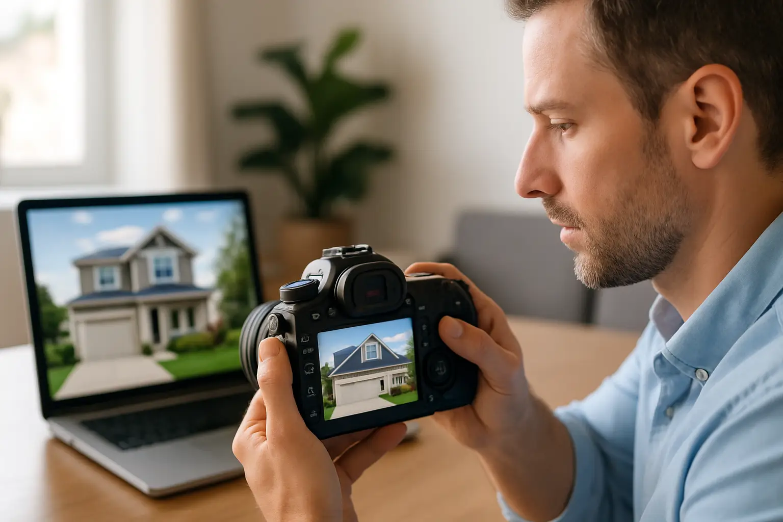
You know the moment. Your new listing goes live, you send the link, and within minutes the client asks, “Why does the living room look dark on Zillow?” Not “How’s the price?” Not “When are showings?” Just the photos.
That’s because Zillow is a swipe-first marketplace. Buyers decide in seconds whether your property earns a save or gets skipped. The frustrating part is that great photography can still look underwhelming if it’s uploaded in the wrong order, exported poorly, or edited without Zillow’s compression and mobile display in mind.
This is the practical, agent-focused playbook to optimize photos for Zillow listings so your media performs the way it should – more clicks, more saves, more showings, and fewer awkward “can we retake these?” conversations.
What “optimized” means on Zillow (and what it doesn’t)
Optimizing isn’t about turning a normal house into a fantasy. It’s about making sure the photos load fast, look clean on phones, and tell a clear story that keeps buyers moving deeper into the listing.
Zillow will compress images. It will display them differently depending on device. And buyers will see your first few images in a small carousel before they ever read a single word of remarks. So your job is less “upload the gallery” and more “publish a sequence that sells.”
There’s also a trade-off: aggressive editing and ultra-wide distortion can boost initial clicks but hurt showing-to-offer conversion if buyers feel misled. Optimization should increase interest while keeping expectations accurate.
The Zillow photo stack that drives clicks
If your first photo doesn’t stop the scroll, the rest of the gallery barely matters. Zillow is a thumbnail game at the top and a mobile swipe game after that. You need a first impression that reads instantly.
Start with the strongest exterior or hero interior, depending on what actually sells the house. If the curb appeal is excellent – clean landscaping, good light, fresh paint – lead with the front. If the exterior is average but the inside is the wow factor (renovated kitchen, dramatic great room, wall of windows), lead with the interior hero shot.
Then build a sequence that feels like a walkthrough, not a random folder dump. A good order reduces confusion and keeps buyers oriented, which increases saves and showing requests.
A reliable flow is: hero image, alternate angle of the same space, kitchen, primary living area, primary suite, best secondary bedrooms, best baths, office/bonus spaces, outdoor living, then supporting areas like laundry, garage, basement, and community amenities.
If you have a view, pool, or acreage – don’t bury it. Zillow buyers hunt for lifestyle cues. Put the “reason to tour” in the first 8-12 photos.
Don’t let one bad room poison the gallery
Every property has a weak link: the dated half bath, the cramped secondary bedroom, the unfinished utility area. You usually still need to show it, but you don’t need to feature it early. If photo 6 is the “sad room,” you can feel the momentum drop.
Put the best rooms up front. Put the necessary-but-unsexy rooms later. You’re not hiding facts, you’re keeping attention long enough for the buyer to see the full value.
Export settings that survive Zillow compression
Zillow will compress your photos, and compression punishes sloppy exports: banding in skies, crunchy shadows, and muddy interiors. The goal is to feed Zillow files that compress cleanly.
Aim for high-resolution JPEGs exported at a quality level that preserves detail without being massive. You don’t need billboard-size files, but you do need enough pixels that the image stays sharp after Zillow processes it.
Keep your aspect ratio consistent across the set. Mixed crops make the gallery feel chaotic on mobile, and important features can get clipped in previews.
Also watch file size. Oversized images can slow load times, especially on cellular, which increases bounce. Optimization is part visual quality, part speed.
If you’re working with a photographer, ask for web-ready exports intended for MLS portals, not just “full res.” If you’re editing yourself, export a dedicated Zillow set instead of uploading whatever came off the camera.
Edit for “honest bright,” not “blown out bright”
Buyers love bright photos. Zillow rewards bright photos because they get engagement. But there’s a line between bright and fake, and Zillow’s compression makes fake look worse.
Here’s what holds up best:
Strong but natural white balance so walls look neutral and wood tones look believable. Clean verticals so the house doesn’t look like it’s leaning. Balanced windows where you can still see some exterior detail, but the interior remains the priority.
Be careful with heavy HDR. It can create halos around windows, crunchy textures on cabinets, and an “over-processed” vibe that buyers now recognize instantly. The trade-off is real: HDR might pop in a thumbnail, but it can also reduce trust.
A good rule is: if a buyer walks in and the space feels darker, smaller, or more worn than the photos, you didn’t optimize – you oversold.
Color matters more than you think
Zillow users are comparing listings back-to-back. If your photos run too warm (yellow) or too cool (blue), the home can feel dated or sterile. Neutral color makes finishes look higher-end and helps buyers focus on layout and lifestyle.
Mobile-first framing (because that’s where the traffic is)
Most Zillow browsing happens on phones. That changes how you frame and crop.
Wide shots still matter – they establish layout – but avoid going so wide that rooms look warped. Ultra-wide distortion can make corners stretch and furniture look oddly shaped, which signals “this is smaller than it looks.”
For key rooms, include at least one shot that reads clearly on a small screen: a clean, level composition with an obvious focal point like an island, fireplace, or view. Those images stop thumbs.
Also pay attention to what gets cut off in previews. A vertical crop that clips the top of cabinets or chops a chandelier looks sloppy. Consistent headroom and straight lines make the whole listing feel more professional.
Use captions strategically (yes, Zillow buyers read them)
Captions aren’t where you write marketing copy. They’re where you answer the buyer’s silent questions.
If an image shows a bonus room, say it’s a bonus room. If the basement is unfinished, label it unfinished. If the “bedroom” is best used as an office, call it a flex space. Clarity reduces disappointment and increases qualified showings.
This also protects you in the long run. When your photos and captions match reality, you get fewer time-wasters and more buyers who show up already sold on the right expectations.
Add the images that Zillow shoppers look for
Some photos are “nice.” Others are decision-makers.
Zillow shoppers want to understand: How does it live? How private is it? What’s the outdoor situation? Where does the light come from?
That means your set should include at least one strong backyard or outdoor living image if you have it, plus a clear shot of the primary suite and bath. If the lot is a major value point, aerial photos can make the layout obvious in a way ground photos can’t.
a 3D tour can also help, especially for unique layouts or larger homes where buyers want certainty before scheduling. Not every listing needs it, but when it does, it can reduce friction and boost serious inquiries.
Twilight photos: powerful when the house earns it
Twilight is not a default add-on. It’s a performance tool.
If the home has strong exterior lighting, a great facade, a view, a patio, or a pool, twilight can become the hero image that spikes clicks and saves. If the home is flat-front, shaded, or has minimal exterior lighting, twilight can be underwhelming and not worth leading with.
The “it depends” factor is neighborhood and price point too. In higher-end segments, twilight can signal premium marketing. In entry-level listings, you may be better off investing in clean, bright daytime coverage and a tight image sequence.
Common Zillow photo mistakes that quietly cost showings
Most listings don’t fail because the photos are terrible. They fail because the photos create friction.
The biggest offenders are inconsistent lighting and color across the set, uploading photos out of order, leaving duplicates, mixing in blurry phone shots with pro images, and leading with a weak exterior when the interior is the real selling point.
Another common mistake is over-editing lawns and skies. Buyers can spot it. Clean is good. Fake is expensive.
And finally: too many photos can hurt you if they’re repetitive. Zillow shoppers will swipe, but they’ll also abandon if the gallery feels endless without new information.
A simple quality check before you hit “publish”
Before you upload, run a quick audit like a buyer.
Open the photo set on your phone. Swipe the first 12 images. Do you immediately understand the home? Do the best features appear early? Do any images feel dark, crooked, or strangely colored compared to the rest? If you see one problem image, buyers will too.
Then check your hero photo as a small thumbnail view. If it looks busy, flat, or dim at that size, choose a different lead.
This two-minute check is one of the easiest ways to improve Zillow performance without changing a single thing about the house.
When it’s worth bringing in a pro (and when it’s not)
If you’re listing a home where marketing will determine the outcome – competitive neighborhood, premium price point, unique property, or a seller who expects top-dollar – professional media isn’t a luxury. It’s your leverage.
If the home is truly distressed or priced strictly for land value, you may not need a full media package. Honest, clear documentation might be the better move. But even then, clean, well-composed photos can protect you from wasted showings and renegotiations.
If you want a consistent, repeatable system for listing media in the Shenandoah Valley – fast turnaround, clean edits, and packages that are built to perform online – Villa Views is designed for that workflow. You can book online at https://www.villaviews.co/.
The best part about getting Zillow photos right is that it compounds. One strong listing presentation turns into more saves, more showings, more confident sellers, and an easier next listing appointment – because your marketing isn’t a promise, it’s proof.
Listing photos that sell homes faster.
Professional real estate media with 24-hour delivery across Waynesboro, Staunton, and the Shenandoah Valley.
Book a Shoot